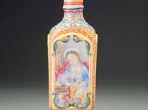
Bonhams Hong Kong set a new outright world record for a Chinese snuff bottle on 28 November 2011, at the auction of the celebrated Mary and George Bloch Collection.
All Antiques, Art and Collecting news is now in one location – click here to view
Bonhams Hong Kong set a new outright world record for a Chinese snuff bottle on 28 November 2011, at the auction of the celebrated Mary and George Bloch Collection.

Part of the Bonhams Autumn Auctions Series in Hong Kong, The Gerard Hawthorn Collection of Yixing Stoneware is an impressive, personal collection of a connoisseur dealer, who has passionately collected the finest quality Yixing ceramics, comparable to the rarest pieces in the Palace Museum, Beijing.

Bonhams has announced outstanding sales of Chinese Art in which the top item was an Imperial Chinese vase which sold for £9,001,250.
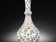
A 16th century Iznik bottle flask from a private Belgian collection with an interesting history linking it to current events in Egypt is one of the top items in Bonhams next sale of Indian and Islamic art on October 4th.
Bonhams & Butterfields have announced its September 25, 2011 Sunset Estate Auction will feature select property from the Estate of award-winning stage, television and film actor John Forsythe.
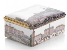
The most important collection of porcelain snuff boxes assembled in the 20th century sold for a total of £1,700,000. The collection was formed by Helmut Joseph and comprised some 80 boxes covering the history of European Snuff Boxes.

A recently discovered, English ebony bracket clock attributed to Ahasuerus Fromanteel sold for a remarkable £692,000 on 28 June at Bonhams, New Bond Street, as part of its sale of Fine Clocks and Watches.

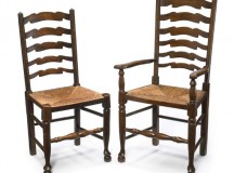
An important pair of American Aesthetic ivory-inlaid parcel-gilt maple side chairs commissioned for the Morgan residence in New York City which are estimated at $70,000-90,000 highlight the final auction of the season at Bonhams, New York.

A pair of George II burr walnut card tables, which are believed to have been commissioned by Sir Thomas Dyer, 5th Baronet (1694-1780) for the Elizabethan country house, Spains Hall, near Finchingfield, Essex

Two superbly documented fragments of the original Star Spangled Banner, which inspired America’s national anthem in 1814 as it flew in defiance of the British over Ft. McHenry in Baltimore, MD, and were later in the collection of a Philadelphia museum, are expected to bring $60,000+ when they come up for bid as part of Heritage Auctions’ June 21 Arms & Militaria auction.